
original


※English Follows
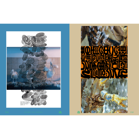
三重野は混沌と秩序との間に張られた綱を巧みに渡る。有機的な形状と精密なグリッドを組み合わせたり、にぎやかな手書きのカリグラフィーを角張ったかたちで曖昧にしたり――ときに意図的に不調和な構図で見る者の視線を釘付けにする。
ジェニー・ブリュワー (It’s Nice That)
—-
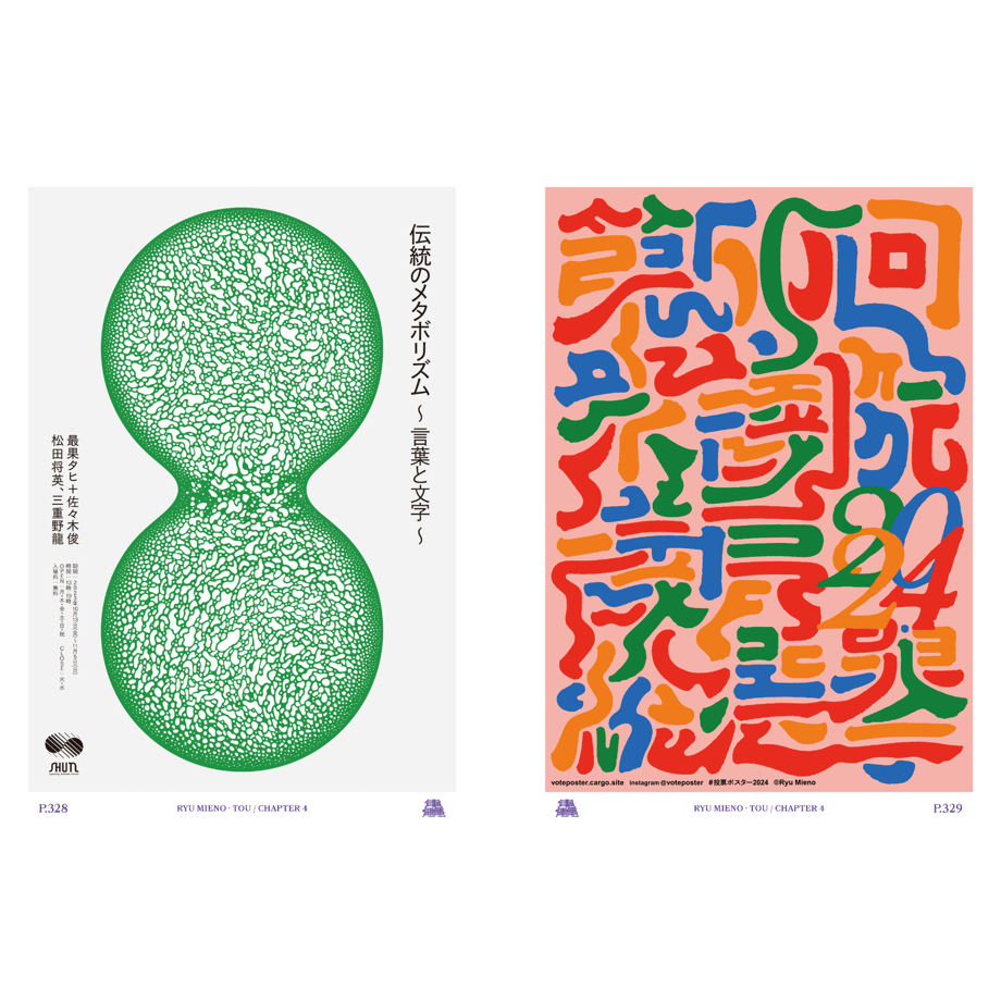
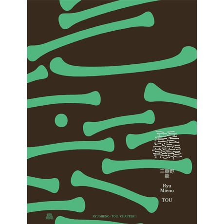
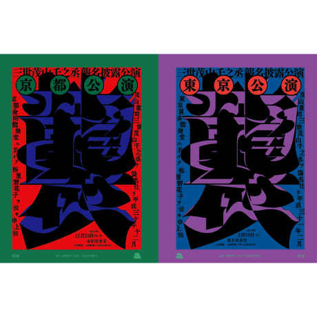
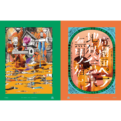
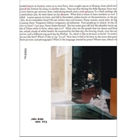
文字を軸にしたグラフィック制作を中心に幅広く活躍する三重野龍の、10年余りにわたる活動の軌跡を収めた初の作品集を刊行します。
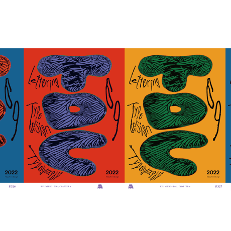
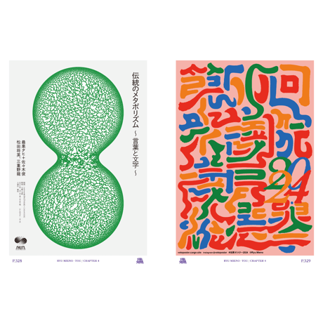
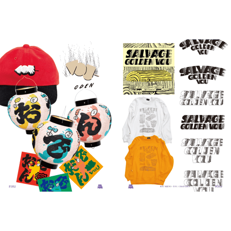
500ページを超える本書では、融通無碍な作風で知られる三重野のグラフィック作品を、「感触の設計」「書体の脱構築」「たゆたう静止画」「五感 to 語感」「意味の調律」という5つのテーマに分類。触覚や時間の経過、抽象と具象の交錯といった観点から、三重野のデザインへの思考や向き合い方を深く分析します。
さらに巻末には、文字やタイポグラフィを基軸とした活動を行う大原大次郎氏と、本書のデザインを担当した一ノ瀬雄太を交えた鼎談を収録。三重野の芯にある行動、思考、感得の様式について対話形式で掘り下げています。
【構成】
巻頭言 by Jenny Brewer(It’s Nice That)
第1章 感触の設計
第2章 書体の脱構築
第3章 たゆたう静止画
第4章 五感 to 語感
第5章 意味の調律
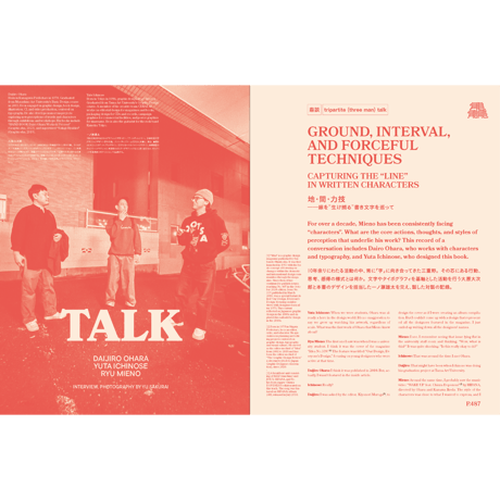
巻末鼎談 地・間・力技――線を“生け捕る”書き文字を巡って
by 三重野龍 ✕ 大原大次郎 ✕ 一ノ瀬雄太
カラー512頁
B5変型
かがり上製本
240×182×45mm
日英テキスト収録
著者:三重野龍
編集・解説:桜井祐(TISSUE Inc.)
装丁・デザイン:一ノ瀬雄太
発行:TISSUE Inc.
発行日:2025年4月予定
印刷:株式会社シナノ
ISBN 978-4-909287-10-6
Mieno expertly treads the tightrope between disorder and order. Sometimes he uses jarring compositions to command our gaze: the juxtaposition of organic shapes and exact grids, or busy, hand-drawn calligraphic type obscured by rectangular, angular imagery.
Jenny Brewer (It’s Nice That)
—-
We are excited to announce the publication of the first-ever art book by Ryu Mieno, a designer who has been actively creating graphic works centered around typography for over a decade. This comprehensive collection captures the trajectory of Mieno’s creative journey.
Spanning over 500 pages, this book categorizes Mieno’s diverse and fluid graphic works into five themes: “Designing the Feeling,” “Deconstruction of Typefaces,” “‘To and Fro’ Still Images,” “Five Senses into Linguistic Sensibility,” and “Tuning the Meaning.” Each chapter delves into Mieno’s design philosophy and approach, analyzing his work through perspectives such as tactility, the passage of time, and the interplay between abstraction and representation.
The book also includes a special roundtable discussion at the end, featuring Mieno in conversation with Dai Ohara, a typography artist, and Yuta Ichinose, the book’s designer. Together, they explore Mieno’s core principles, his thinking process, and his unique way of perceiving and expressing ideas in typography.
[Contents]
Foreword by Jenny Brewer (It’s Nice That)
Chapter 1: Designing the Feeling
Chapter 2: Deconstruction of Typefaces
Chapter 3: “To and Fro” Still Images
Chapter 4: Five Senses into Linguistic Sensibility
Chapter 5: Tuning the Meaning
Discussion: Ground, Interval, and Power Play — Capturing the “Line” in Written Characters
by Ryu Mieno, Dai Ohara, and Yuta Ichinose
Full Color, 512 Pages
Custom B5 Format
Thread-Bound Hardcover
240×182×45mm
Planned Price: ¥10,000 (ex. Tax)
Bilingual Text (Japanese and English)
Author: Ryu Mieno
Editor & Commentary: Yu Sakurai (TISSUE Inc.)
Book Design: Yuta Ichinose
Publisher: TISSUE Inc.
Publication Date: Scheduled for April 2025
Printing: Shinano Co., Ltd.
ISBN 978-4-909287-10-6
Other Items
-
- 【Limited Item】石田真澄 「everything will flow」ヘキサゴンチーフA
- 3,850 JPY
-
- 熊谷直子写真集「赤い河」(TISSUE PAPERS 01)
- 3,300 JPY
-
- NONCHELEE 作品集「LIFE GOES ON」(TISSUE PAPERS 02)
- 4,180 JPY
-

- 【Limited Item】石田真澄「everything will flow」ヘキサゴンチーフB
- 3,850 JPY
-
- 高橋恭司写真集 / Kyoji Takahashi photo book「Midnight Call」(TISSUE PAPERS 08)
- 8,250 JPY
-
- NONCHELEEE 「BOSSA HOUSE」 (TISSUE PAPERS 04)
- 1,980 JPY